


Army AL&T magazine wanted to bring back a yearly favorites campaign previous branded as the ALTies. But first, they wanted a new look and name.
First, we needed a name. I read through magazine articles, AL&T’s social media, and the command’s website to get a feel for the kind of language used and the words and phrases that popped up often. After looking at synonym lists for words like “favorite” and researching common phrases or figures of speech associated with the army, I paired each army related word with an adjective that either flowed well or provided alliteration. When I had several options, I created a poll via teams. The winning option was “Frontline Favorites”, with “the Top Brass” finishing in close second.
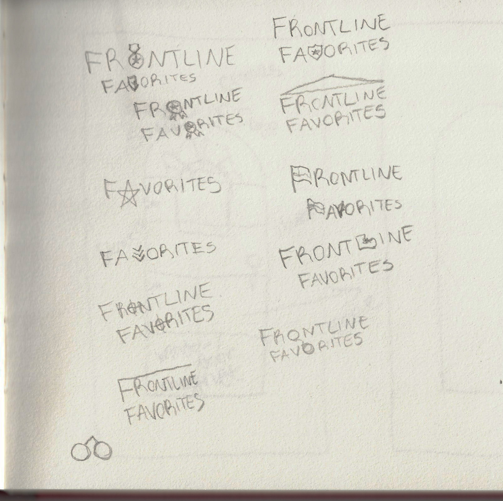
Now that we had a name, I could better visualize the kinds of imagery that would make sense. In my sketchbook, I started writing “Frontline Favorites” over and over again in different styles and experimenting with different imagery that would either complement the text or could replace one of the characters. Once I had ideas for 3 unique logos, I opened up Adobe Illustrator and began digital mockups. The first option had binoculars replacing the O’s in “Frontline” and “Favorites”, referencing both surveillance usage for the warfighter and support staff watching to assist and support from a distance. Next, I created a version with a combat boot replacing the L in “Frontline Favorites” as a direct reference the warfighter. Finally, I wanted to add a choice that did not rely on a design element replacing a character for variety, so I created a version with the text centered above a military-inspired chevron. I also used 2 typefaces for this one: a blocky, structured sans serif to evoke troops on the frontline on the frontline, with "Favorites" being in a handwritten typeface to suggest personal choice and preferences. The client also wanted to see a version that featured the previous ALTies logo, so I added that to this version on top to mimic the lower chevron.
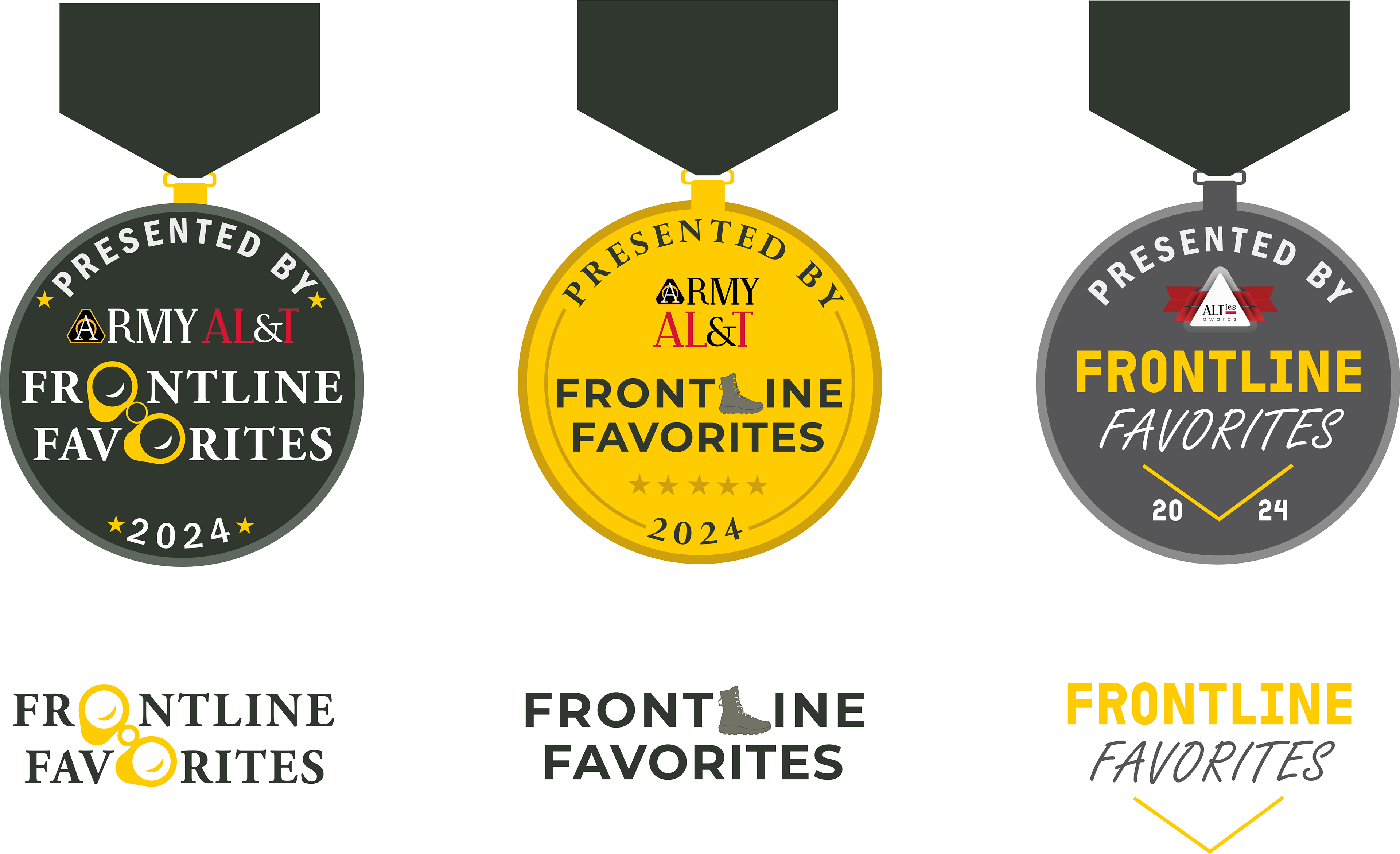
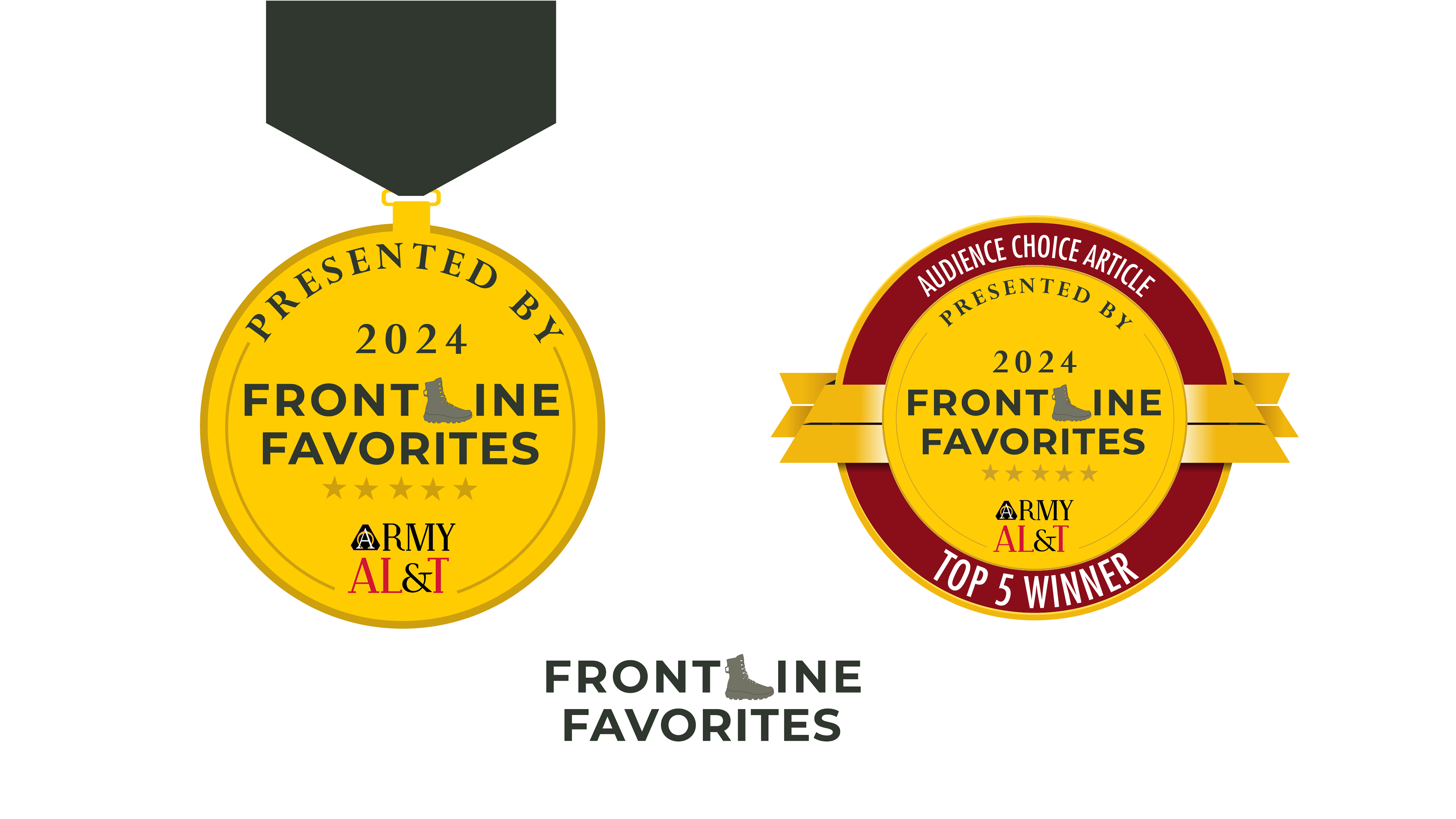
After the second option was picked, I had to finalize the design for the medal I would place it on, as well as update the winner’s badge design from previous years. I researched army service medals, the ribbons the come on, and their designs and meanings, so that the design wouldn’t be similar enough to actual service awards that it could be inappropriately mistaken for a different award.
For both the magazine ad and social media posts, I went straight into InDesign and started moving assets around as the deadline gave me less time than previous deadlines. When I do this, I open InDesign, import the assets and text needed, and start moving around the pieces like a puzzle to see where it fits.
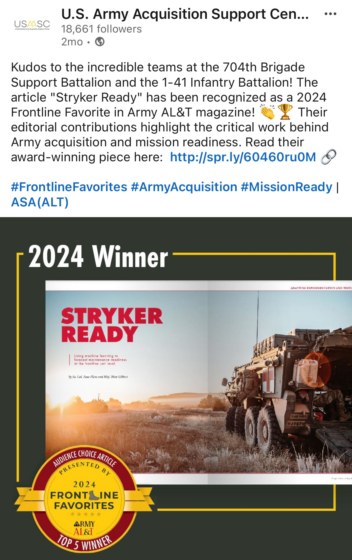
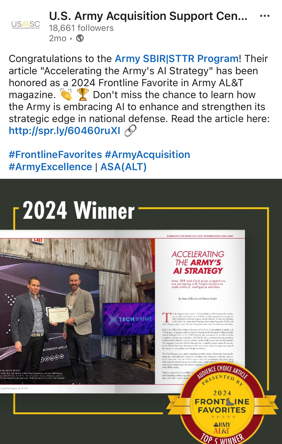
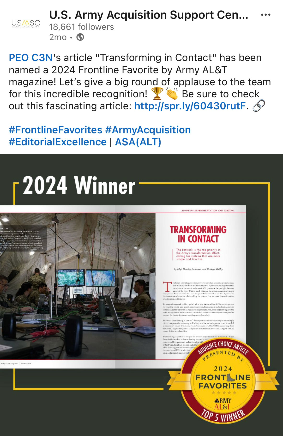
For the social media posts to announce the winners, I kept the design fairly simple as I wanted to include both a magazine spread of the winning articles and the winner’s badge, both of which have a lot going on. I used a simple background and border in Army brand colors to tie the two together.
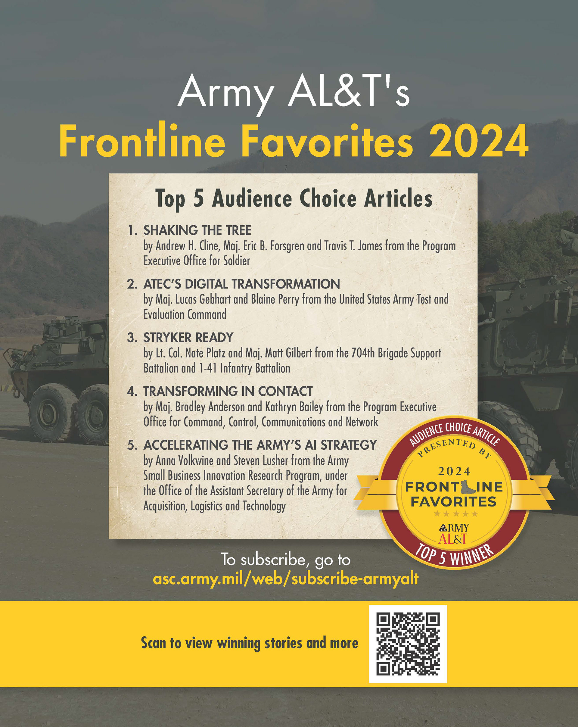
For the magazine ad, the purpose was to recognize the winners as well as include a call to subscribe. In the background, I used a photo from one of the winning articles. Winners are listed on a textured sheet of paper as a reference to the medium and for emphasis.